Interview with graphic designers Punch Bowl Design
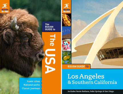
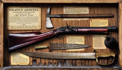
Today’s exciting interview features Liz Wiffen and Drew McGovern from Punch Bowl Design. This Brisbane duo are very different in their approaches to design, but come together to create beautiful, fun, and interesting books and corporate brochures.
Of the pair, Drew admits that he is the analytical one. He likes to spend time considering what the “audience” is looking for. Liz on the other hand likes to research and explore all areas of the project which then leads to her designs coming together. Even though Liz and Drew have very different approaches to their creativity, they definitely compliment each other!
Their creative practice together involves asking lots of questions, sometimes arguing points of view, procrastinating and lots and lots of sketching. Liz admits, If a solution is proving particularly elusive, hitting a bucket of balls at the driving range often does wonders!
To see more of their interesting projects, check out the Punch Bowl Design website or follow Liz on Twitter.
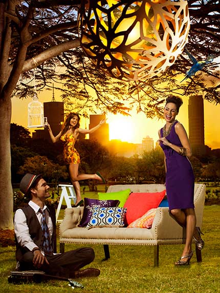
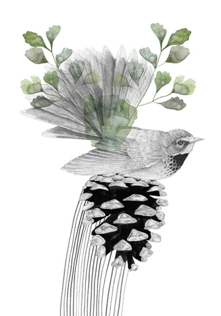
Photoshop retouching for Brisbane Guide cover image.
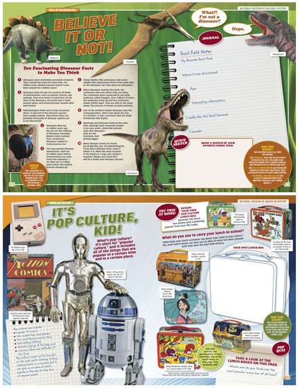
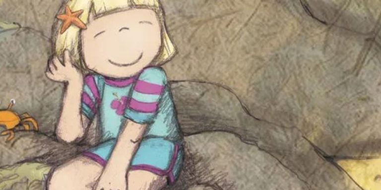
Spreads from a kids guide to three Smithsonian museums
in Washington DC.
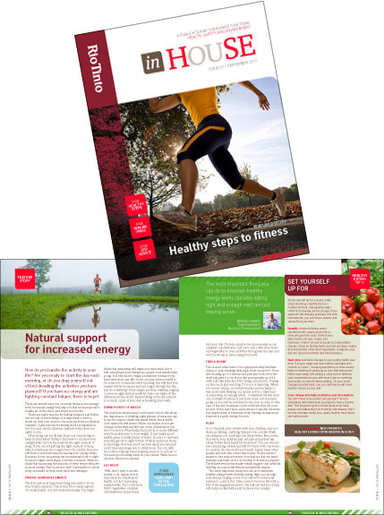
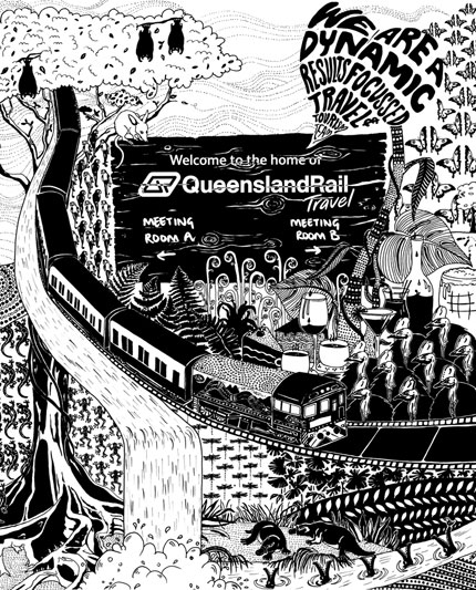
Spread and cover mock-up for an in-house publication for Rio Tinto.
How have you got to where you are today?
Liz: I was an addictive doodler as a kid always covering blank sheets of paper with patterns of nonsensical scribble. As a teenager I planned on being an architect but then was introduced to the concept of what was back then termed “commercial art”.
I started my studies straight from school with Queensland College of Art. I have been working in Graphic design related fields ever since. I found my forte in book publishing design and thoroughly love designing covers and internals. With the changes to technology and the “book” as we know it I’m finding my specialty is also about flexibility and adaptation.
Drew: Ever since I can remember, my life has been guided by two themes: my love of making things; and a healthy wanderlust for ‘exploring’ the world around me – so I guess it was inevitable that I’d wind up at art college sooner or later. And in the mid 80’s I did just that. After a false start initially studying Illustration, I changed my major to Graphic Design and have pretty much been in the biz ever since.
I have in the past worked as an image re-toucher, so I work a lot in Photoshop as well – often building up images with textures, tones and colours. I love the expressive qualities of visually rich imagery (you can say so much with a good image) so I use this approach whenever a job needs it.
In a few words, describe yourself…
L: Seriously silly, shamelessly shy.
D: A comfortably unfashionable dag.
What are you spending your time on at the moment?
L: I’m working on an art/craft book called Fabulous Surfaces for a publisher in the UK. These are beautiful books showcasing sensational craft items photographed by Michael Wicks. It is a book were the images are the stars of the show and text is left pure and understated yet hold authority and function. The challenge for me as the book designer is to get the balance right.
D: I’m earning my first nerd stripes learning HTML, CSS and Java Script at TAFE at the moment. I’m up to knees in it and loving it to bits!
Do you have a ritual for getting into the creative mindset? Or a creative process?
L: I’m a morning person so I tend to be able to bounce out of bed and be firing immediately. It does mean I tend to crash and burn late afternoon pretty spectacularly on the dot of five, conveniently aligning with the perfect time of beer o clock. I love to research, whether it be on the web, the local library or the local bookshops.
If time allows I prefer to let a client’s brief ferment in my head for a healthy length of time. I believe even the subconscious has a way of working on a brief even when physically I’m not. I begin by simply playing around with what I’ve found. I aim to come up with multiple ideas to then be able to cull out the ones which I’m unhappy with and to present only the ones I’m happy with.
I love to take my own personal bets to which direction the client will choose, I’m usually spot on. If I do find I get stuck on a brief I’ll go for a walk, get some air and a change of scenery. It never seems to fail to bring me back more focussed to the job at hand.
D: Coffee: strong, black.
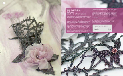
Spread from a sewing craft book.
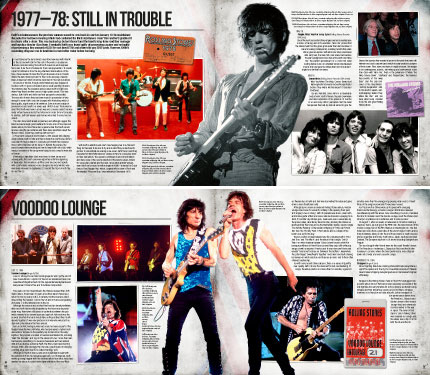
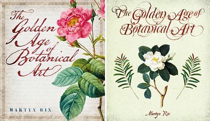
Spreads from a book about the Rolling Stones.
What or who inspires you?
L: WHAT: Simple and effective typography. I’m really drawn to covers or posters where typography is kept to it’s simplest. I love the use of understated typographic quirks that cleverly whisper rather then shout. WHO: Derek Birdsall (legendary British book designer) – he used to shop at our local Tesco’s when we lived in London. I secretly spied on him to see what he bought.
D: WHAT: Elegant solutions to problems: whether they’re creative or technical problems. Oh, and I also admire the ability some people have of great story telling. WHO: Pretty much anyone who not only has Vision, but who also follow through and make that Vision a reality.
What are you most proud of?
L: Being able to start and run a viable business. PBD started trading in November 2010 and is ticking along nicely. I would say to anyone who is contemplating starting a business it’s definitely a whole and heavy bag of hard work but the rewards are sensational and well worth the blood sweat and tears.
I love saying to my boss (i.e. me) “screw you I’m out of here”, then I go grab a coffee or go see a movie and later come back to my desk inspired and re-energized. Obviously there are times when you feel all you do is live, eat and sleep at your desk but somehow when you are doing it for yourself it doesn’t seem really that bad.
D: Whenever someone instantly “gets” a design I’ve done. Nice.
When you were a child, what did you want to be when you grew up?
L: A Charlie’s Angel.
D: A ship’s captain.

