Interview with designer Dan Pike
Dan Pike, Founder and designer at The Letter D has a curious yet measured approach. He is also a key speaker at today’s Analogue/Digital conference in Brisbane.
Influenced by his love for industrial design and architecture, Dan has created brandmarks, typefaces, and publications for clients that are primarily interesting to him. Beginning his career as an industrial designer, Dan recalls, “it was here that I discovered that Cs and Ss fell below baselines, to visually align, and I never looked back…”
Dan’s creative combination of lettering and architecture shows through in his Instagram with a thoughtful collection of signage, colours, and spaces. Dan regularly inspires students at Billy Blue’s Brisbane campus and was on the judging panel for the 2012 AGDA Awards.
In talking to Dan about his creative practice, he unveils the importance of building long-term relationships with clients that break down the client/supplier barrier. Dan, like many of us, is trying to find a comfortable work and family balance in life. With two young boys, he’s a proud Dad, yet with his thoughtful and somewhat reserved personality from the outset, you wouldn’t know it!
Dan has a Bachelor’s and Post Graduate Diploma in Industrial Design from QUT. The Letter D have recently released its own publication imprint aptly titled Capital P.
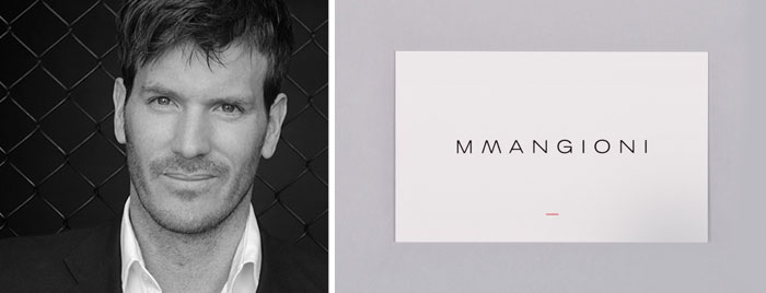
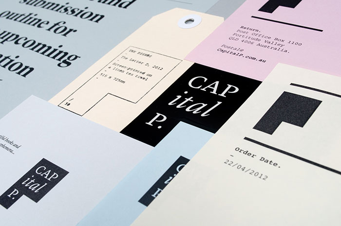
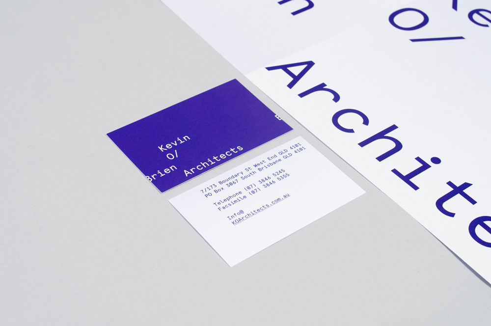
Capital P Stationery.
Tell me about your creative journey. Your passion for your craft and how you discovered or nurtured it.
On reflection, it all seems like a bit of an accident. I studied industrial (product) design, and only discovered the world of type from documenting signage for a large practice, MTB, with offices in Brisbane and Sydney. We worked on large residential estates, shopping centers, and Sydney’s International Airport.
I always had a keen interest in the psychology of the built environment, and how we interact with places, products, and systems, so it seems inevitable that developing directional (wayfinding) signage would lead to graphic user interfaces and on to shaping how we perceive and interact with identities.
With some strong guidance from the senior designers at MTB, I read as much as I could on the practice of graphic design and ended up teaching myself Flash to build MTB’s first website.
This could go on forever so I’ll wrap up by saying the journey has simply been a desire to discover design and its impact on the entities around us… I guess it’s why I’m never content with the creation and yearn for the next challenge.
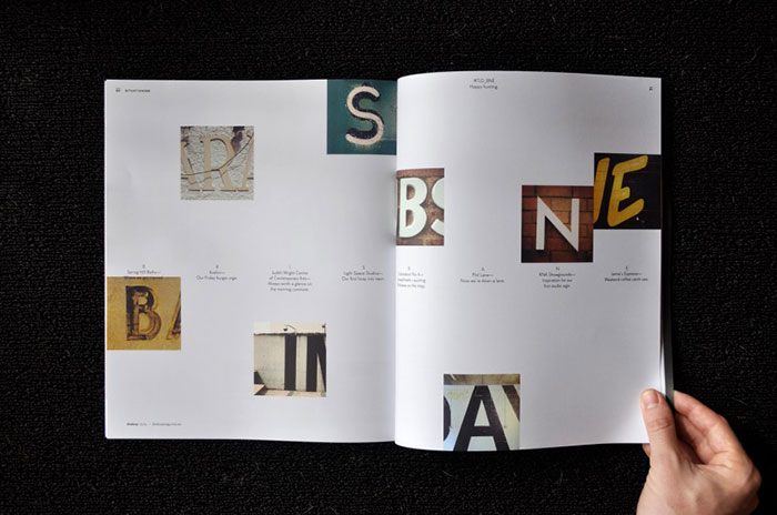
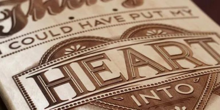
Desktop Magazine, May 2013.
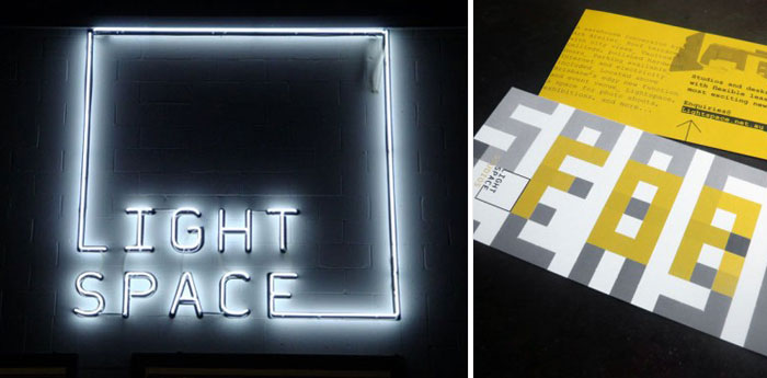
Custom typeface, identity, and website for Brisbane venue Lightspace.
“It’s strange that as a creative industry we really only have two five-letter A-grade monopolies to choose from… Apple and Adobe.”
In a few words, describe yourself…
Pursuing simple, chaotic order.
What are you spending your time on at the moment?
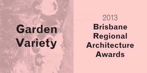
Currently collaborating with a well-regarded local architecture practice, Owen and Vokes and Peters, on the graphic direction for the 2013 Brisbane Regional Architecture Awards—including a book/exhibition cataloguing the entries.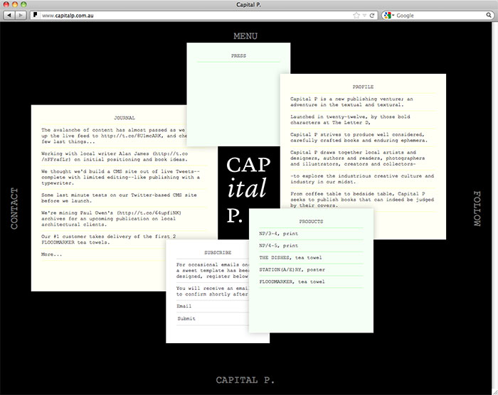
Tell me about your creative process.
Usually, ideas come from the initial client conversation, and it’s why we get personal and pry as much as we can out of the client, in terms of their expectations and desires. Most clients are blind-sided by this but we find it’s the best way to break away from the misnomer of supplier (does websites, stationery, etc) and focus on a partner-based relationship (looks for ways to connect with their audience). A client brief will therefore hardly ever define the direction–just the deliverables… We tend to respond with our own brief to confirm with the client that we know what they’re after and have the foundations of a direction to build on.
The actual form of the design though usually starts with scribbling, and it’s why I tend to carry my pencil and notebook with me, to jot down thoughts/ideas as they happen. Sometimes they have to happen to a deadline, that’s when you have to push yourself. But it usually helps if the initial conversation has been a good one—and it’s why communication is at the heart of what we do—it’s the transfer of ideas that you have to be good at to succeed. How we do that is what differentiates us as designers.
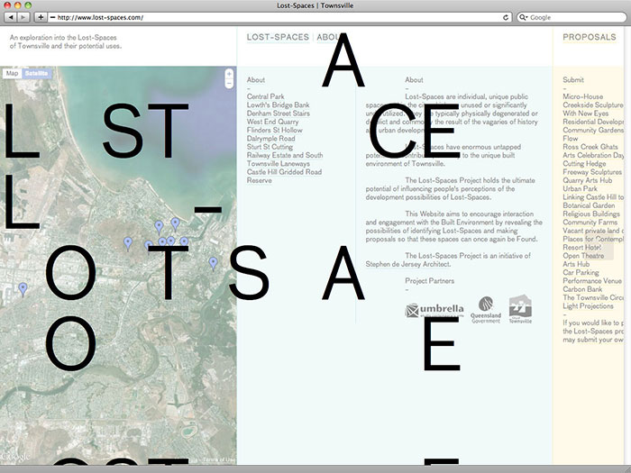
Tools of the trade. What are your absolute necessities for your creative practice?
Adobe Design Suite—and unfortunately Adobe knows it.
It’s strange that as a creative industry we really only have two five-letter A-grade monopolies to choose from—Apple and Adobe.
What or who inspires you?
Anyone generating their own content, or at least keen to promote the value of design, as there’s nothing worse than Tumblr feeds full of inspiring visuals without any context or credit.
I also have no idea how people create music. It surprises and impresses me that there are people who can think in sound…
What are you most proud of?
Being able to support a family and staff, doing what I enjoy.
When you were a child, what did you want to be when you grew up?
I really can’t remember, no doubt an astronaut? Although after the movie ‘Gravity’ comes out later this year, am not sure my sons are going to have the same aspiration.

